| Rank | Company | Country |
|---|---|---|
| #1 | Germany | |
| #2 | Japan | |
| #3 | Netherlands | |
| #4 | Germany | |
| #5 | United States |
| Rank | Company | Country |
|---|---|---|
| #1 | France | |
| #2 | Japan | |
| #3 | Germany | |
| #4 | United States | |
| #5 | Japan |
The current version of the Ford logo was introduced, featuring a sleeker, more streamlined design with a minimalist font and a flatter oval shape.
The Ford logo has continued to evolve over the years, with the blue oval design being introduced in 1927 and refined over time to become the modern logo we know today.
While the Ford logo doesn't have a domain-specific symbolism compared to other car logos, it still has some meaning.
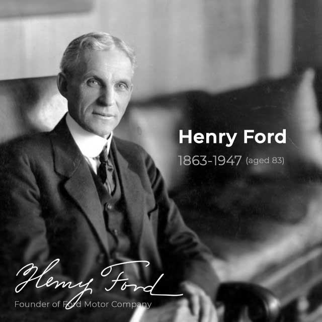 Founder of Ford Motor Company — Henry Ford (1863-1947, aged 83)
Ford Motor Company was named after its founder, Henry Ford (despite some controversies, Henry Ford's impact on American industry and society cannot be denied).
His introduction of the assembly line revolutionized the way cars were manufactured, greatly increasing production efficiency and reducing costs. This allowed the Ford Motor Company to produce cars at a much faster rate and at a lower cost than its competitors. This made automobiles more accessible to people, particularly the Model T, which was the first car that the average American could afford.
The Ford signature has been a key element of the company's logo for over a century and has remained largely unchanged since its introduction.
It's worth noting that the Ford logo does not come directly from the signature of the founder Henry Ford. However, the typography used in the logo is based on his handwriting. The font was created by Childe Harold Wills, a Ford Motor Company engineer and designer who was a close associate of Henry Ford, by studying Ford's signature and then adapting it to create a unique and recognizable font for the company's logo.
By using Henry Ford's handwriting as the basis for its logo, Ford is able to pay tribute to its founder and to connect with its history and heritage.
The Ford oval emblem introduced by Perry, Schreiber, and Thornton in 1907 was used to advertise Ford as the "hallmark for reliability and economy" in the UK market. The oval shape of the emblem is believed to have been chosen to emphasize the company's reliability and economy, as well as its association with the automotive industry and its representation of speed and motion.
The blue color in the 1927 Ford logo was added by Childe Harold Wills, who was among the first to associate with Henry Ford and played a crucial role in designing the iconic Model T. The blue color was chosen to represent the qualities of strength, excellence, and trustworthiness that the Ford brand was known for.
While it is true that the blue color in the Ford logo is associated with strength, excellence, and trustworthiness, there is no official meaning behind the white color used in the logo. However, white is often associated with purity, elegance, and simplicity, which could be why it was chosen to complement the blue color in the logo. The combination of blue and white creates a clean and classic look that has become synonymous with the Ford brand.
Today, the Blue Oval logo has become one of the most recognizable and iconic logos in the world, and it continues to be a symbol of the Ford Motor Company's legacy and reputation for quality and innovation.
RELATED: The 7 Best Ford Muscle Cars
The original Ford logo used in 1903 was much more intricate than the current Ford logo. It was a circle with art nouveau borders and said "Ford Motor Co. Detroit, -Mich.-" on it. The logo was green and wasn't rendered in the distinctive script that we see today.
The logo was designed by C. Harold Wills, one of Henry Ford's earliest business partners, and was used on the company's first car, the Model A.
In 1907, British agents Perry, Schreiber, and Thornton introduced the Ford oval emblem. They were the precursors to the first Ford Motor Company in the UK. This oval advertised Ford as the “epitome of reliability and economy.”
While the Ford logo has undergone several changes over the years, the oval emblem introduced in 1907 was an important early iteration of the brand identity that helped to establish Ford as a major player in the automotive industry.
In 1909, the Ford Motor Company began using a signature created by Henry Ford as its visual identity that would go on to become the core of the company's logo and branding concept. This signature, which featured script lettering with an elongated tail on the letter "D." However, this elongated tail was later removed in subsequent versions of the logo.
The 1911 Ford logo featured the word "Ford" in script lettering, which was an imitation of Henry Ford's handwriting, and a oval with the words "The Famous Motor Cars" in block letters. The logo also included a design element that resembled a coat of arms.
The script lettering was slightly altered from the previous version used from 1909 to 1910 to make it bolder and more legible.
In 1912, Ford decided to simplify its logo, refining the design from 1911. The signature of Henry Ford was placed inside a white oval with black lines outlining it. This was a simple yet elegant logo that lasted for ten years.
According to some sources, the 1912 variant logo was inspired by design created by Childe Harold Wills, a member of the Ford Motor Company's early design team. The logo was intended to convey a sense of speed and motion, with the wings or bird design suggesting flight.
This variation of the logo was used by Ford's British subsidiary and was one of the earliest examples of the blue oval that has since become a defining feature of the Ford logo.
In 1927, the Ford logo underwent another significant change. The color palette was changed to blue and white, and the frame was slightly modified to include a double line with thick white and thin blue lines.
This new design was a significant departure from the old versions of the Ford logo, which had been primarily monochrome. The addition of blue to the color palette was a bold move that helped the logo stand out and become more recognizable.
This new design became a prototype for the Ford logo that we know today, with only minor modifications made over the years to keep it current while still retaining its classic design.
The between 1957 and 1976, the Ford Motor Company experimented with different borders for its emblem, demonstrating the company's commitment to continually refining and improving its branding over time. While the typography remained largely the same, these experiments aimed to make the logo more visually appealing and memorable while still retaining its classic design.
The 1976 Ford logo was a bold and modern design that is still familiar to many people today. The logo was designed to be more eye-catching, with a bold, three-dimensional design that stood out from previous versions of the logo. The white of the typography and the surrounding border for the emblem changed to silver in 1976, which further enhanced the modern look of the logo.
The 2003 Ford logo is known as the "Centennial Blue Oval" and was released in honor of the company's 100th anniversary. This logo is a simplified version of the previous logo, without the 3D gradients and shading.
However, in 2017, Ford switched to a design inspired by the 1962 prototype, which is a departure from the "Centennial Blue Oval" logo released in 2003.
It's also worth noting that the 2003 version of the logo has not completely disappeared, some models still have it marked on the interior.
The 2017 Ford logo is a modern rendition of the iconic blue oval logo that has been used by the company since the late 1920s. This version of the logo features a simple, flat design with a bold blue oval and the Signature, with no additional design elements or embellishments.
According to Ford, the new logo was designed to reflect the company's commitment to innovation, technology, and sustainability. The simplified design was intended to be more modern and streamlined, while still retaining the core elements of the classic Ford logo.
Overall, the evolution of the Ford logo demonstrates the company's commitment to modernizing its branding while still honoring its heritage and legacy.
RELATED: The 7 Best Engine Ford Ever Made
| Rank | Company | Country |
|---|---|---|
| #1 | Germany | |
| #2 | Japan | |
| #3 | Netherlands | |
| #4 | Germany | |
| #5 | United States |
| Rank | Company | Country |
|---|---|---|
| #1 | France | |
| #2 | Japan | |
| #3 | Germany | |
| #4 | United States | |
| #5 | Japan |