| Rank | Company | Country |
|---|---|---|
| #1 | Germany | |
| #2 | Japan | |
| #3 | Netherlands | |
| #4 | Germany | |
| #5 | United States |
| Rank | Company | Country |
|---|---|---|
| #1 | France | |
| #2 | Japan | |
| #3 | Germany | |
| #4 | United States | |
| #5 | Japan |
The two smaller circles within the larger circle form the letter “T”. This represents “Toyota”, along with “trust” between the brand and the driver.
The Toyota brand is named after its founder's surname, Kiichiro Toyoda. However, it is worth noting that the original Toyota was called "Toyoda", not "Toyota".
On September 1, 1933, Toyota Automatic Loom Works established a division for the manufacture of automobiles--the forerunner of today's Toyota Motor Corporation.
In July 1936, the automobile department of the Toyoda Automatic Loom Works, Ltd. (today's Toyota Industries Corporation) celebrated the completion of its first passenger car by holding a public design competition for the Toyoda logo. The event was also intended to reinforce advertising and sales of Toyoda cars. At the selection meeting held on September 25, a design featuring Japanese characters for Toyota (トヨタ) surrounded by a circle was chosen among some 27,000 entries sent in from all over Japan.
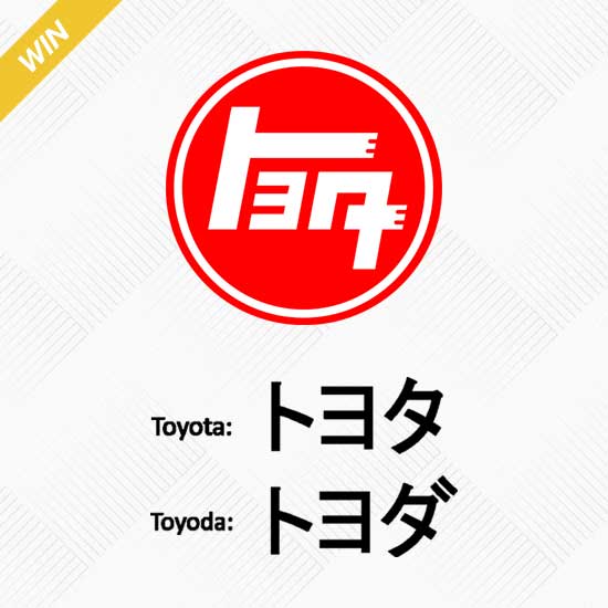 The winning design was a circular logo featuring the word "トヨタ" (Toyota) in Japanese characters.
In terms of commercial design, Japanese characters for "Toyota" were visually simpler and less cluttered; the name also sounded more pleasant to the ear ("Toyota" represents a voiceless consonant sound in Japanese, which is considered "clearer" than voiced consonants like in "Toyoda").
The number of strokes to write Japanese characters, called "jikaku," is also a factor. Eight strokes are believed to be connected to wealth and good fortune, and "Toyota" (トヨタ) contains exactly eight strokes.
Since "Toyoda" literally means "fertile rice paddies", changing the name also prevented the company from being associated with old-fashioned farming.
Departure from the Toyoda name also implied the company's growth from a family business into a broader-based social entity; the change also signified the expansion of a small independent company to a larger corporate enterprise.
On August 28, 1937, the Toyota Motor Company was officially established, after Kiichiro Toyoda, the company's founder, successfully trademarked the newly formed word "Toyota." And it formally transferred this business from the Toyota Automatic Loom Works to the new entity on September 29, 1937.
Overall, the change in name from Toyoda to Toyota was a significant moment in the company's history and helped establish the brand as we know it today.
The three ovals in the Toyota logo are arranged in a horizontally symmetrical configuration and represent different elements. The two perpendicular ovals inside the larger oval represent the heart of the customer and the heart of the company, which overlap to represent a mutually beneficial relationship and trust between each other. This is a powerful symbol that speaks to Toyota's commitment to building strong relationships with its customers and stakeholders.
The overlapping of the two perpendicular ovals inside the outer oval also forms the letter "T" for Toyota, as well as a steering wheel representing the vehicle itself. This is a clever and effective way to incorporate the company's name and product into the logo design.
The outer oval symbolizes the world that embraces Toyota, which is a nod to the company's global reach and impact. The different stroke thicknesses in each oval are also a reference to traditional Japanese brush art, which is a nice touch that reflects Toyota's cultural heritage.
Finally, the space in the background within the logo represents the infinite values that Toyota wishes to convey to its customers, including superb quality, value beyond expectation, joy of driving, innovation, and integrity in safety, the environment, and social responsibility. This is a powerful message that speaks to Toyota's commitment to excellence and its broader social and environmental responsibilities as a global corporation.
RELATED: 5 Best Toyota Off-Road Vehicles of All Time
On September 1, 1933, Toyota Automatic Loom Works established a division for the manufacture of automobiles--the forerunner of today's Toyota Motor Corporation. This original "TOYODA" trademark was registered by the company on July 27, 1935, and used on cars and other vehicles produced by the department.
Therefore, this original "TOYODA" logo was used on vehicles produced before Toyota Motor Corporation was officially founded, including the Toyota AA/AB/AC and G1 trucks.
The original Toyota logo features a blue background and a stylized octagon. The inscription "TOYODA" in the middle comes from the last name of the founder of the company. This logo reflects Toyota's origins--from an automotive division of a manufacturer of Automatic Loom Works to grew into today's global leader of the automotive industry.
In 1936, the automobile department of Toyoda Automatic Loom Works, Ltd. (today's Toyota Industries Corporation) held a public design competition for a new logo to represent the company. The competition was intended to reinforce advertising and sales of Toyoda cars, and the winning design was chosen from over 27,000 entries; The winning design was a circular logo featuring the word "トヨタ" (Toyota) in Japanese characters.
The change in the brand name from "Toyoda" to "Toyota" occurred the following year, in 1937. The new name was chosen because it was simpler to pronounce and easier to remember than "Toyoda", and because it contained eight brush strokes in Japanese characters, which is considered a lucky number in Japanese culture.
Overall, the public design competition held in 1936 played a significant role in the development of the Toyota brand identity.
What does the Toyota “トヨタ” logo mean?
The Toyota "トヨタ" logo is a Katakana representation of the company's name, which is written in Japanese characters. Katakana is one of the three writing systems used in Japan, and it is used to represent words using phonetic symbols.
![]()
Many Toyota automobile enthusiasts mistakenly believe that "トヨタ" stands for "TEQ/Technology," which was the previous name of the Toyota Research and Development department before it was changed to "TRD" (Toyota Racing Development). However, the true meaning of "トヨタ" is simply a representation of the company's name in Katakana characters.
So, the Toyota "トヨタ" logo is a representation of the company's name in Katakana characters, and it does not have a specific meaning beyond that.
The 1958 Toyota logo was a significant departure from the previous logos used by the company. The developers removed the geometric shapes from the emblem and made the inscription in English. The result was a concise trademark: the black word "Toyota" on a white background, with strokes of letters of uneven thickness and long narrow serifs at the ends.
The lettering was executed in a bold serif typeface, similar to fonts like Times New Roman and Nimbus Roman Japanese Bold, which had clean yet elegant lines that reflected the characteristics of the brand.
The clean and simple design of the logo made it easy to recognize and memorable, which is why it remained in use for several years. It helped to establish the brand's identity in the American market and has since become the original version of the company's wordmark.
In 1969, Toyota made significant changes to its logo. The style of the wordmark was changed to a sans-serif font, similar to Hypersans Heavy but slightly narrowed, and written in black. By simplifying the lines of the logo, Toyota aimed to achieve a more modern and progressive look.
The new logo was not drastically different from the previous one. The font choice shifted to the classic Helvetica, known for its straight lines, clear geometric shapes, and lack of serifs. The characters in the wordmark were closely spaced, with the "Y" letter appearing to rest on two "O" letters on the sides.
In 1978, Toyota underwent another logo change and returned to its bright red and white color scheme. The wordmark used in this logo is similar to the one used today.
The font used in the 1978 logo is similar in style to the previous one, but with a reduced height and greater spacing. This change likely helped to improve the legibility of the logo and make it more visually appealing.
Overall, the 1978 logo change was an important moment in Toyota's branding history, as it helped to establish the look and feel of the Toyota wordmark that we know today.
The first iconic oval emblem was introduced in October 1989, and the logo was to commemorate the 50th anniversary of the company. Since then, the logo has remained largely unchanged, with only minor modifications to the font and color scheme over the years.
The logo is comprised of three ellipses. The inner horizontal and vertical ellipses represent the expectations of customers and the ideals of the car manufacturer, respectively. These two ellipses are interlocked to form the letter T for Toyota, which is a clever and effective way to incorporate the company's name into the logo design.
The outer ellipse represents the global expanse of Toyota's advanced technology and its infinite potential for growth. This is a powerful symbol that speaks to Toyota's ambition and global reach as a leading automotive manufacturer.
Overall, the Toyota logo is a simple yet effective design that incorporates multiple layers of meaning and symbolism. It's no wonder that it has become one of the most recognizable logos in the world of automotive manufacturing.
In 2005, Toyota introduced a new version of its logo that featured significant changes. The red graphical emblem was moved above the lettering and given a three-dimensional appearance with a gradient silver color. The badge was enlarged, and the contours of the emblem were emboldened, creating a more prominent and dynamic look. The lettering of the word "TOYOTA" remained relatively unchanged, with only a darker and deeper shade of red.
This redesigned logo became highly recognized and associated with Toyota, especially as it appeared on the bonnet (hood) of their cars. It is one of the most iconic versions of the Toyota logo.
Since the introduction of the new Toyota logo in 2019, Toyota has announced:"Don’t use the 3-D corporate logo in brand communications".
It's worth noting while the core elements of the Toyota logo remain consistent, it's possible that there are different versions or adaptations used in specific markets or for specific purposes; these variations can be used to cater to specific cultural preferences or to align with regional branding strategies.
For example, the version used in the USA features a white emblem composed of three ovals inside a large red square with black sans-serif lettering for the word "Toyota" to the right of the square, additionally with more styles.
On July 20, 2020, Toyota launched a new brand design for the European market with a reworked version of its logo and typography, with the new logo featuring a simplified, 2D design that distills the emblem to its most recognizable elements. The new logo is intended to communicate simplicity, transparency, and modernity, and is well-suited to digital and physical spaces alike.
The European version of the Toyota logo is a composition of ovals in a dark gray color; this version does not include the word "TOYOTA" in the emblem itself, as the logo is already well-known across Europe; the logo has a more minimalist and understated look compared to the American version, which features bright and saturated colors.
RELATED: The World's Top 3 Automakers By Sales In 2022 (Toyota No.1)
| Rank | Company | Country |
|---|---|---|
| #1 | Germany | |
| #2 | Japan | |
| #3 | Netherlands | |
| #4 | Germany | |
| #5 | United States |
| Rank | Company | Country |
|---|---|---|
| #1 | France | |
| #2 | Japan | |
| #3 | Germany | |
| #4 | United States | |
| #5 | Japan |