| Rank | Company | Country |
|---|---|---|
| #1 | Germany | |
| #2 | Japan | |
| #3 | Netherlands | |
| #4 | Germany | |
| #5 | United States |
| Rank | Company | Country |
|---|---|---|
| #1 | France | |
| #2 | Japan | |
| #3 | Germany | |
| #4 | United States | |
| #5 | Japan |
The name Subaru is derived from a term identifying a cluster of six stars called the Pleiades in the Taurus constellation.
In Japanese, the word "Subaru" (スバル) can be translated to mean "unite" or "together." It reflects the idea of coming together, merging, or gathering as a group.
Subaru Corporation chose the name "Subaru" to represent the idea of unity and the connection between people, as well as to honor the Pleiades star cluster, which has significance in both Japanese and Greek cultures.
In Greek mythology, the Pleiades star cluster is associated with the story of Atlas, a Titan who was tasked with holding up the heavens. According to the myth, Atlas had seven daughters, the Pleiades. Eventually, the daughters were transformed into stars, forming the Pleiades cluster.
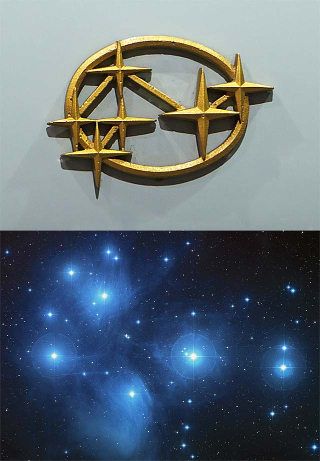 The Pleiades, also known as The Seven SistersThe former logo on a 1958 Subaru 360 shows six stars in an arrangement similar to the Pleiades open star cluster.
The logo of Subaru Corporation, the automobile manufacturer, consists of a cluster of stars enclosed within an oval shape. The stars represent the Pleiades star cluster, which is known as "Subaru" in Japan. Here are the meaning and symbolism behind Subaru's logo:
Pleiades Star Cluster: The stars in the logo represent the Pleiades, a prominent star cluster in the constellation Taurus. In Japanese, the Pleiades cluster is called "Subaru." The use of the Pleiades in the logo connects Subaru to its Japanese heritage and cultural significance.
Six Stars: The logo depicts six stars, which are visible to the naked eye; the seventh star is not visible without the aid of a telescope. This choice represents the largest and brightest stars in the Pleiades cluster. The stars also symbolize the six companies that merged to form Fuji Heavy Industries, the parent company of Subaru.
Unity and Harmony: The stars in the logo are arranged in a cohesive and balanced manner, reflecting the concepts of unity and harmony. It represents the collaboration and integration of different entities coming together to form a unified whole.
Enclosed Oval: The stars are enclosed within an oval shape in the logo. The oval represents the Earth and signifies Subaru's global reach and commitment to providing its products and services worldwide.
RELATED: 8 Car Logos with Stars, Did You Know?
The early logo featured a simplified representation of the Taurus constellation, with six large stars connected by short lines. The stars were placed within an oval frame, symbolizing the part of the universe where the Pleiades cluster is located.
The silver color with a cold metallic sheen, as well as the balanced distribution of light and shadow, were intentional design choices to create a three-dimensional effect. This design approach aimed to enhance the visual impact and give the emblem a sense of depth and dimensionality.
A few years later, the logo changed to gold while still retaining the three-dimensional effect. In this variation, the stars were elongated horizontally, and the beams connecting them were lengthened to achieve this effect.
Additionally, this version's oval frame was thinner than the previous design, and the stars had clear protruding edges with a slight reflection in the central part. These design changes likely aimed to refine the visual presentation of the logo while maintaining the overall three-dimensional appearance.
In 1959, the first colored Subaru emblem was approved, marking an important milestone in the brand's visual identity.
The 1959 Subaru logo featured a silver framing and stars of the same silver color, placed on a red background. This color scheme was chosen to symbolize Subaru's passion for progress and movement.
The new emblem introduced in 1979 featured an oval shape with stars, which remained from the previous design. However, it was now placed within a U-shaped figure with a flattened bottom part. This modification gave the emblem a distinct visual element.
In the redesign, the frame of the logo was corrected to have a uniform thickness, allowing the elongated parts of the stars to protrude beyond the boundaries of the oval. Instead of a red background, a dark blue color was adopted, evoking the image of the night sky adorned with small luminous dots. Among these dots, the bright constellation Subaru stood out.
One notable change in the 1980 logo was the addition of a visible black outline to the silver voluminous lines of the badge. This black outline aimed to add a sense of confidence and professionalism to Subaru's visual identity. It likely helped to enhance the visibility and impact of the logo.
In this version, the lines connecting the stars were omitted since their outlines were already connected. The frame of this emblem consisted of white, gray, and black lines, with the central line being white and the side lines being gray and black respectively.
In the same year, Subaru made significant refinements to their logo, which brought it closer to the design we are familiar with today. By eliminating the connecting lines and repositioning the stars, Subaru achieved a cleaner and more streamlined look for their logo. This modification resulted in a more cohesive and balanced design that enhanced the overall visual appeal of the logo.
These improvements in shape and composition were crucial in shaping the evolution of the Subaru logo and played a significant role in establishing a distinct and recognizable visual identity for the brand. The refined logo became an iconic symbol associated with Subaru's values and products.
The Subaru logo introduced in the year 2000 featured a significant update from the previous designs. It transitioned from a more traditional emblem-style logo to a simplified and modernized representation.
The 2000 Subaru logo consisted of a blue oval shape with a chrome border. Inside the oval, the six stars of the Taurus constellation, representing the Pleiades cluster, were arranged in a geometric pattern. The stars were now depicted in a chrome or silver color, with a three-dimensional appearance and sharp edges. The chrome finish added a sense of sophistication and modernity to the logo.
The wordmark "Subaru" was placed below the oval emblem in a bold and uppercase font. The letters were rendered in silver or chrome, complementing the overall metallic theme of the logo. The wordmark was aligned with the bottom edge of the oval, creating a balanced and visually pleasing composition.
In 2003, Subaru introduced an updated version of its logo. This logo is very similar to the previous logo from 2000, with some minor refinements. The shading of the blue in the logo became darker and more sophisticated, adding a touch of elegance to the design.
Additionally, the stars in the logo are designed with cleaner and bolder lines, enhancing their visibility and making them stand out. The outline of the oval shape is also more pronounced, adding definition and strength to the overall design.
In the current iteration of the Subaru logo, there have been some notable changes to the color palette and the overall design. The navy blue background has transitioned to a lighter azure hue, while the gray has faded to a light silver shade. Despite these changes, the gradient effect has been retained, adding a metallic sheen to the logo.
The arrangement and shape of the stars have remained mostly unchanged, but due to the updated color palette, they appear larger and more prominent. The ellipse surrounding the stars has visually become narrower and longer, creating a sleeker and more modern look for the logo.
Additionally, the lettering representing the brand name has been recolored in dark gray, ensuring that it no longer contrasts starkly with the graphic symbol. This creates a more harmonious and cohesive overall appearance for the logo.
| Rank | Company | Country |
|---|---|---|
| #1 | Germany | |
| #2 | Japan | |
| #3 | Netherlands | |
| #4 | Germany | |
| #5 | United States |
| Rank | Company | Country |
|---|---|---|
| #1 | France | |
| #2 | Japan | |
| #3 | Germany | |
| #4 | United States | |
| #5 | Japan |