Jaguar got its name through a series of evolutions and changes during the early years of the company. The original company, Swallow Sidecar Company, was founded in 1922 and specialized in making motorcycle sidecars. It was later renamed SS Cars Limited in 1934 when they started producing complete cars with custom bodies.
The name "SS" stood for "Swallow Sidecar," derived from the founders' initials, William Lyons and William Walmsley. However, the "SS" initials became associated with the Nazi Schutzstaffel during World War II, leading to a negative connotation. To disassociate themselves from this unfortunate association, the company decided to change the name.
In 1945, after World War II had ended, the company changed its name to "Jaguar Cars Ltd." The name "Jaguar" had been used as a model name for some of their vehicles even before this change. The choice of the name "Jaguar" was likely inspired by the powerful and graceful qualities of the animal, reflecting the image the company wanted to project for its cars.
So, the company officially became Jaguar Cars Ltd in 1945, and the name has remained synonymous with luxury, performance, and elegance in the automotive world ever since.
The meaning of the Jaguar logo lies in the representation of the brand's core values and attributes. The logo depicts a stylized leaping jaguar, and it embodies several key characteristics that Jaguar wants to associate with its vehicles:
Overall, the Jaguar logo is designed to evoke a sense of excitement and exclusivity, appealing to individuals seeking both performance and luxury in their vehicles. It is a powerful emblem that embodies the essence of the Jaguar brand and its aspiration to produce exceptional cars that captivate drivers and onlookers alike.
Jaguar Logo Timeline
01of 81922
PNG
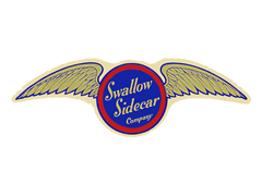
The early logo of the Swallow Sidecar Company in 1922 was a blue circle in a red frame with two gold wings. The name of the company, "Swallow Sidecar Company," was written inside the circle, reflecting its primary business of manufacturing motorcycle sidecars.
The logo design of the Swallow Sidecar Company conveyed speed, elegance, and innovation. The two wings in gold symbolized the brand's commitment to producing high-performance vehicles, while the blue circle meant reliability and stability. The color red around the design showed the company's energy and dynamism.
RELATED: 17 Car Logos with Wings, Did You Know?
02of 81935
PNG
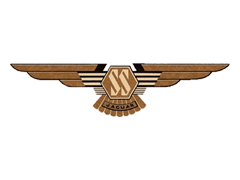
The Swallow Sidecar Company was initially established to manufacture motorcycle sidecars, and later, it expanded its operations to produce complete cars with custom bodies. In 1935, "Jaguar" was introduced as a model name for some of the cars produced by the Swallow Sidecar Company. The company had a range of vehicles under the "SS Jaguar" model name, including the SS 90 and SS 100 sports cars, which were highly regarded for their performance and elegance.
The "Jaguar" name was initially used in conjunction with the "Swallow Sidecar" initials, reflecting the transitional phase of the company's identity and its journey towards becoming Jaguar Cars Ltd.
03of 81945
PNG
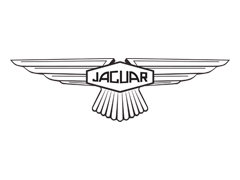
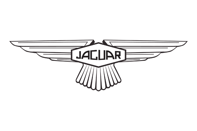
In 1945, after World War II had ended, the Swallow Sidecar Company changed its name to Jaguar Cars Ltd. This rebranding was a significant step for the company, marking a fresh start and creating a new identity under the name Jaguar.
As part of the rebranding, the controversial "SS" initials were replaced with a new bold typeface for the company's name. The new typeface was designed to create a shape that repeated the form of a hexagon, symbolizing a sense of unity and strength. The varying heights of the letters in the logo design added a dynamic touch, reflecting the exciting and powerful nature of the brand.
The leaping jaguar logo introduced later has further solidified Jaguar's position as a prestigious and powerful luxury car brand in the automotive world.
04of 81951
PNG
The 1951 redesign resulted in a minimalist approach, featuring only an uppercase logotype for the Jaguar badge. The inscription, executed in black characters, adopted a sleek full-shaped font with thick lines for the letters and thin elongated serifs on their ends. This design choice conveyed a sense of elegance and sophistication, reflecting the brand's image as a luxury car manufacturer.
This version of the logo was utilized by the automaker for six years, during which it continued to reinforce Jaguar's identity and reputation as a prestigious automotive brand.
05of 81957
PNG
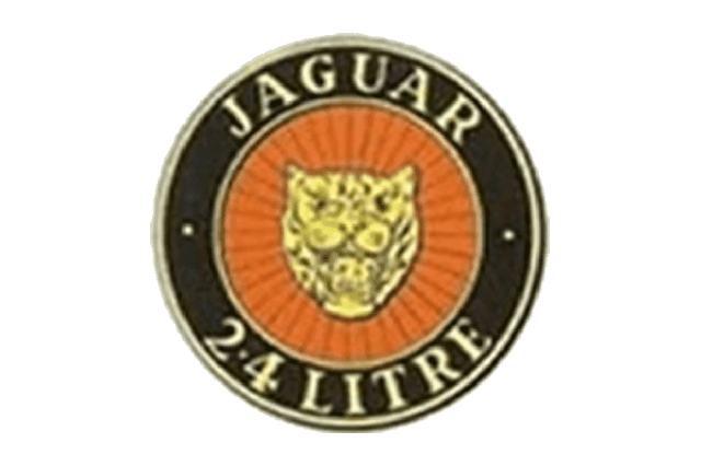
The new grille of the Jaguar 2.4 Litre saloon was accompanied by a round emblem with a bright and distinctive color palette. The emblem featured a wide black border with the inscription "Jaguar" across the top and "2.4 Litre" at the bottom. In the center of the emblem, there was a head of a jaguar on an orange background with rays creating a textured look.
This logo was indeed a departure from the previous designs and introduced the jaguar head, which soon became the iconic visual identity of the Jaguar brand. The use of bold and vibrant colors, along with the powerful representation of the jaguar head, conveyed the brand's image as a strong and exciting luxury car manufacturer.
06of 81982
PNG
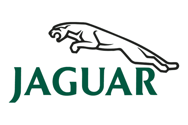
The leaping Jaguar logo was introduced in 1982, and the first version was similar to the current emblem we know today. The jaguar's contour was black, and it was accompanied by an all-caps wordmark written underneath. The dark green color of the wordmark made the logo eye-catching and added to its visual appeal.
In the subsequent version, the logo underwent some streamlining to give the jaguar a more natural look. The angles were rounded, and small details like the tech and ears were added to enhance the design. The wordmark became black, and the typeface's lines were made thinner and more elegant, further refining the logo's overall appearance.
07of 82012
PNG
The 2012 Jaguar logo featured a three-dimensional animal figure in silver gray, exuding a sense of sophistication and modernity. The bold and confident silver wordmark complemented the 3D shape of the jaguar, creating a harmonious and distinctive design.
The gradient effect in the gray color added depth and movement to the logo, making it look sleek and dynamic. This visual treatment contributed to the logo's overall vitality and elegance, capturing the essence of the Jaguar brand's high-end style and quality.
08of 82021-Present
PNG
The 2021 redesign of the Jaguar logo reintroduced a flat contoured design, with the lines of the leaping jaguar being made more prominent and slightly modified for a modern touch. The uppercase inscription was rewritten in a new extended Sans-serif font, with futuristic and progressive contours for the capital characters.
Such changes in the logo design can be part of a brand's efforts to maintain a contemporary image, appeal to new audiences, or reflect the evolution of the company's values and vision.
Throughout its history, the Jaguar logo's evolution demonstrates the brand's efforts to modernize and refine its visual identity while maintaining its iconic representation of power, agility, and luxury.
 Volkswagen
 Toyota
 Stellantis
 Mercedes-Benz Group
 Ford Motor
 Michelin
 Bridgestone
 Continental
 Goodyear
 Sumitomo
