| Rank | Company | Country |
|---|---|---|
| #1 | Germany | |
| #2 | Japan | |
| #3 | Netherlands | |
| #4 | Germany | |
| #5 | United States |
| Rank | Company | Country |
|---|---|---|
| #1 | France | |
| #2 | Japan | |
| #3 | Germany | |
| #4 | United States | |
| #5 | Japan |
The shield denotes the courageous origins of a noble family, being taken from the shape of shields used by the crusaders.
*Throughout its history, Cadillac's logo has undergone several iterations. We have collected here only some of the most important versions.
The name "Cadillac" originated from Antoine de la Mothe Cadillac, a French explorer who founded the city of Detroit in 1701. When the Cadillac Motor Company was established in 1902, its founder, Henry Leland, chose to name the company after Cadillac to honor his pioneering spirit and the brand's deep connection to the heritage of Detroit. This deliberate choice aimed to evoke a sense of nobility, luxury, and a strong association with its namesake, solidifying the prestigious image that the brand sought to convey.
The name "Cadillac" is derived from Antoine de la Mothe Cadillac's title, which was "sieur de Cadillac." The title "sieur" is a French term of nobility, and "Cadillac" was the name of a town in the region of France where Antoine de la Mothe Cadillac was born.
Therefore, although the name "Cadillac" has French origins due to its association with Antoine de la Mothe Cadillac, it is not a commonly used French surname or word in contemporary French language and culture.
The Cadillac logo carries rich symbolism. It features a shield, which represents the courageous origins of a noble family and draws inspiration from the shields used by crusaders. The shield is divided into four quarters.
The first and fourth quarters display the arms of the Mothe family. The prominent elements in these quarters are the bird-like figures known as "merlettes," which resemble martins without legs or beaks.
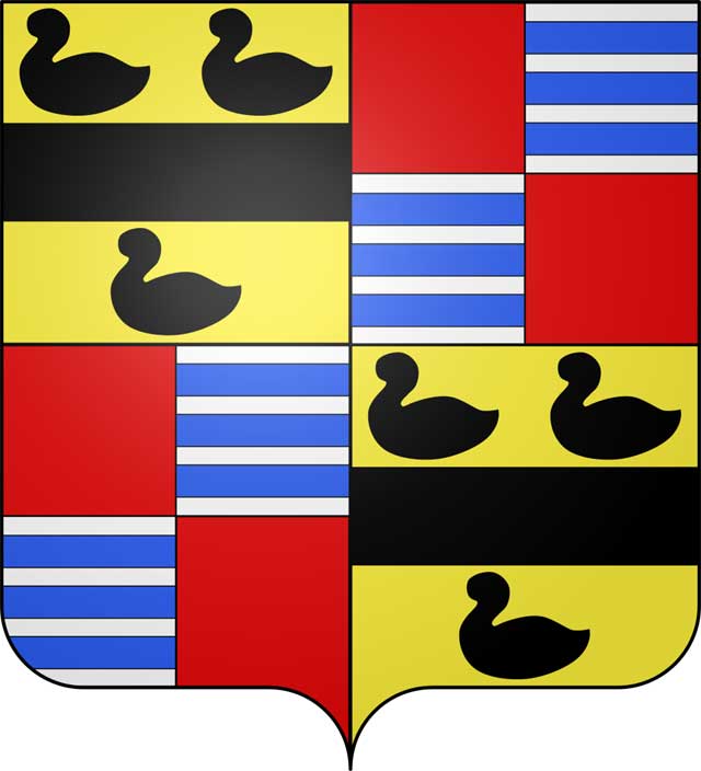 The family coat of arms of Antoine de la Mothe Cadillac
The merlettes hold significance as they were traditionally granted to younger brothers as a symbol to focus on the wings of virtue and merit, rather than relying on their limited land.
When depicted as a trio, the merlettes symbolize the Holy Trinity. They were often awarded to knights who made notable contributions during the crusades by the ancient School of Heralds.
The color scheme of the logo, black against gold, represents wisdom and wealth. The "fess," a lateral bar, is an honor bestowed for valiant conduct during the Crusades and signifies the holder's commitment to protecting the public welfare.
The second and third quarterings are believed to have been added to the Mothe coat of arms after a favorable marriage which increased the family's estates. The colors indicate "prowess and boldness in action" (red), "purity, charity, virtue and plenty" (silver), and knightly valor (blue). The repetition of the crossbar or "fess" indicates more knightly valor during the Crusades.
RELATED: Cadillac Trivia Quiz (part 1)
In 1906, the Cadillac logo features a wreath surrounding a crest with a crown, which is a distinct and separate emblem created for the Cadillac brand. It was designed to evoke a sense of luxury, elegance, and prestige.
Antoine de la Mothe Cadillac, the French explorer and adventurer, served as the inspiration for the Cadillac brand. The inclusion of his name in the logo was a way to pay tribute to his pioneering spirit and to establish a connection between the brand and its founder.
The Cadillac Flying Goddess logo was designed by designer William Schnell in 1933. The logo featured a flying goddess with high wings and a raised head, symbolizing dignity, luxury, and sophistication with Cadillac vehicles. It was first introduced on the series 452C model in 1933 and subsequently became an iconic emblem for Cadillac vehicles.
RELATED: Top 7 Most Expensive Car in the 1930s
In December 1941, after the United States entered the war, Cadillac shifted its production to support the military effort by manufacturing military equipment for the army. However, a small number of civilian cars were still produced during this period.
During this time, the Cadillac logo underwent some changes. The angel wings that were previously featured on the logo were replaced with two straight wings with sharp edges located behind the crown and shield. This new design gave the impression of readiness for battle, symbolizing Cadillac's commitment to support the war effort.
After World War II, Cadillac resumed civilian car production and started creating new models. In addition to producing new car models, Cadillac also made changes to its logo, adding a "V" under the crown and shield to highlight its role in establishing the quality standard of the V-shaped engine.
During the 1950s, Cadillac introduced an innovative design element in its car model – the tail fin. This design element became increasingly prominent and reached its peak in 1959 when the tail fin height grew to a remarkable 965mm.
Starting in 1964, Cadillac moved away from the iconic tail fin design and began incorporating a new design element: vertical taillights. The vertical taillights became a signature design feature for Cadillac and have been incorporated into their models since then.
In addition to the change in the taillight design, the Cadillac logo also underwent another update. The "V" in the previous logo was replaced by a laurel crown, which symbolized prestige, achievement, and the brand's commitment to excellence. This updated logo further solidified Cadillac's reputation as a luxury carmaker and showcased their dedication to delivering top-quality vehicles.
In 1989, Cadillac introduced an updated logo design that aimed to modernize the brand's aesthetics while still acknowledging its rich history and heritage. The new logo featured an enlarged silver crest, and additional colors, including gold, red, and black, were added to the surface of the emblem. These colors added depth and dimension to the logo, creating a visually striking design.
At the turn of the century, Cadillac made significant updates to its logo to reflect the new technological trends and discoveries of the time. The logo was given a detailed and stylized treatment that enhanced its visual appeal.
The designers incorporated classic outlines of a coat of arms and shapes from the early 1900s, creating a sense of heritage and timelessness in the logo. To add a modern touch, they introduced metallic sheen and additional details, which gave the coat of arms a contemporary and progressive look. This combination of classic and modern elements created a logo that was visually striking and represented the evolving nature of the brand.
In 2009, the designers made the Cadillac logo more intricate by incorporating additional details. One notable change was the introduction of colored rectangles, which featured thin stripes within them. These stripes added visual interest and complexity to the logo design.
In terms of color, the palette of the logo was dominated by a silver-gray gradient with white reflections. This choice of colors likely aimed to convey a sense of sophistication and modernity while maintaining a sleek and elegant appearance.
In 2014, Cadillac made another significant update to its logo design, this time opting for a more streamlined and modernized version. The decorative elements from the previous logo were removed, resulting in a cleaner and more minimalist look.
This updated logo reflected Cadillac's commitment to staying current and aligning with contemporary design trends. By embracing a streamlined and minimalist approach, the logo projected a sense of simplicity, sophistication, and presentability.
In 2021, Cadillac unveiled a new logo as part of its effort to adapt to the new era and highlight its foray into the electric vehicle market. The logo underwent significant changes to align with the brand's renewed focus on electric vehicles and modern aesthetics.
The updated logo features a monochrome icon with an attractive backlight when displayed on cars. While the logo may appear simple at first glance, it exudes a sense of sophistication and modernity. The iconic shield, which is synonymous with Cadillac, remains a central element of the logo. However, all symbolic elements have been removed from the shield, leaving only polygons. The logo now adopts a completely black and white color scheme, emphasizing a sleek and minimalist design.
RELATED: Cadillac Trivia Quiz (part 2)
| Rank | Company | Country |
|---|---|---|
| #1 | Germany | |
| #2 | Japan | |
| #3 | Netherlands | |
| #4 | Germany | |
| #5 | United States |
| Rank | Company | Country |
|---|---|---|
| #1 | France | |
| #2 | Japan | |
| #3 | Germany | |
| #4 | United States | |
| #5 | Japan |