When Chevrolet was developing its two-seater sports car in the early 1950s, the Division was searching for a name that would embody the qualities of speed, agility, and excitement associated with this sports car. During this process, Myron Scott, who worked as an assistant director of public relations at General Motors (GM), is credited with suggesting the name "Corvette" for the new sports car.
The name "Corvette" was ultimately chosen as it successfully captured the essence of speed, agility, and excitement that Chevrolet wanted to convey with their new sports car.
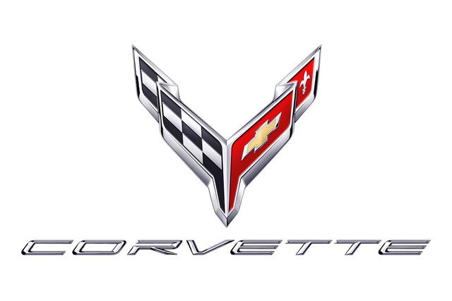
The logo consists of two crossed flags: a checkered racing flag on the left and the Chevrolet bowtie on the right. Here's the meaning behind each element of the logo:
By combining the checkered racing flag and the Chevrolet bowtie, the Corvette logo signifies the fusion of performance and the Chevrolet brand's identity. It represents the Corvette's heritage as a high-performance sports car and its association with racing and speed. The logo has become a symbol of the Corvette's distinct character and has remained a recognizable emblem throughout the car's history.
Chevrolet Corvette Logo Timeline
1of 101953
PNG
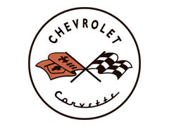
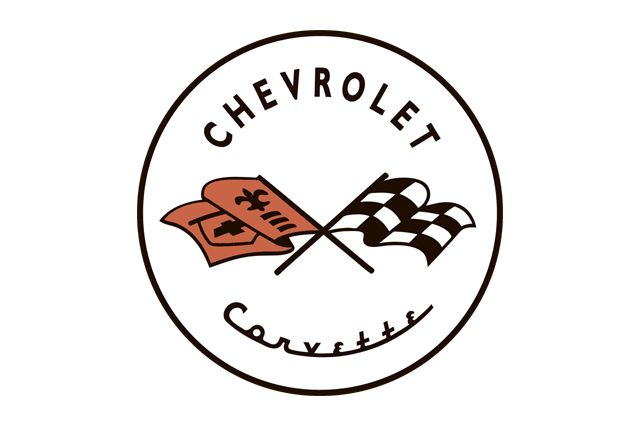
The first Corvette logo, designed in 1953 by Robert Bartholomew, featured a round emblem with a white background and two crossed flags.
One of the flags in the original logo depicted a checkered monochrome racing pattern, symbolizing the Corvette's association with motorsports and racing. The second flag was colored red and featured a fleur-de-lis and three horizontal lines, representing the French heritage of the company.
The wordmark of the original logo was divided into two parts. The top part featured the bold and prominent "Chevrolet" lettering, emphasizing the connection to the Chevrolet brand. The bottom part of the logo showcased the word "Corvette" written in an elegant cursive style, adding a touch of sophistication to the design.
2of 101955
PNG
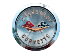
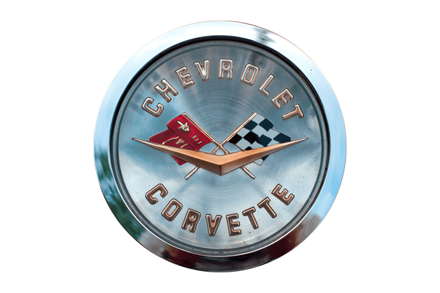
In the 1955 logo, the typography was modified, likely with a new font or style to give it a different look and feel. The graphic elements of the logo were transformed into a three-dimensional design, departing from their original flat shape.
At the bottom of the emblem, in front of the crossed flags, a new element was introduced. The letter "V" was incorporated into the design, taking the shape of clock hands. This visual representation of the letter "V" symbolized the presence of V8 engines, which were equipped in all the sports cars of that era. It served as a distinctive mark to emphasize the powerful engine performance associated with the Corvette.
3of 101963
PNG
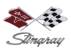
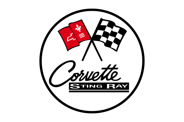
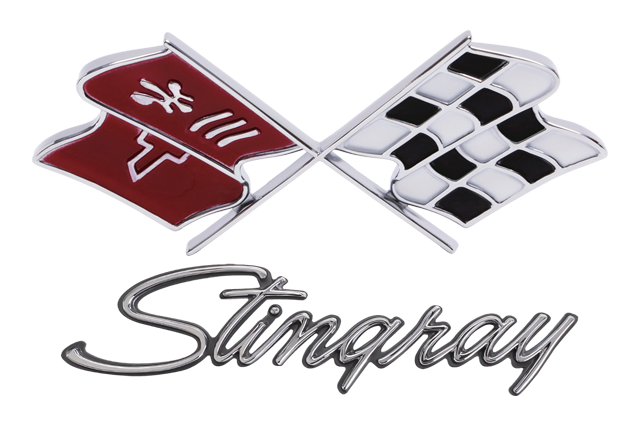
In 1963, the second Corvette model, known as the StingRay, was introduced. The logo underwent significant changes to reflect this new model.
The bottom part of the logo featured the name "StingRay," which appeared inside a black rectangle located below the word "Corvette." This addition aimed to highlight the specific model within the Corvette lineup.
The "Chevrolet" lettering was removed from the logo, as it was deemed unnecessary for sports car enthusiasts who were already familiar with the brand.
RELATED: 5 Car Logos with Flags, Did You Know?
4of 101968
PNG
In 1968, following the release of the third model of Corvette sports cars, some notable changes were made to the logo design.
The circular shape that was present in previous iterations of the logo was removed, resulting in a new emblem without the circular background.
The designers also adjusted the angle of the depicted flags to make them appear more stable and visually balanced. This modification aimed to enhance the overall aesthetics and convey a sense of solidity and strength.
5of 101982
PNG
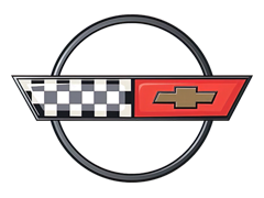
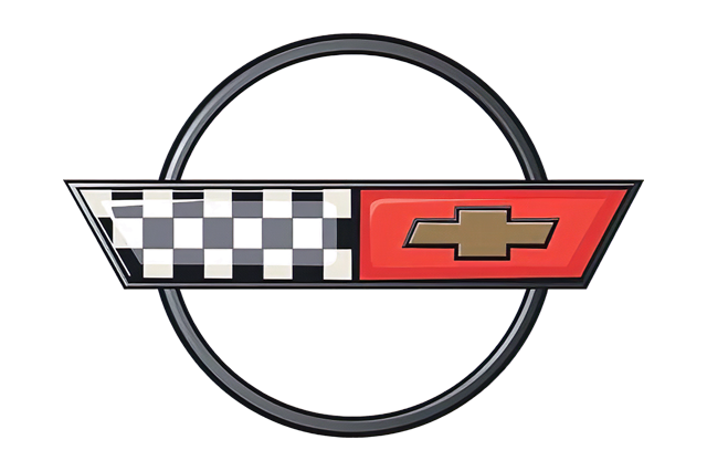
In 1982, a significant redesign of the Corvette logo occurred, resulting in a completely different approach to the design.
The redesigned logo featured a circle intersected by a long, thick rectangle. The rectangle was divided into two parts. The left part retained the checkered flag design, representing the car's association with racing and performance. The right part of the rectangle incorporated the Chevrolet symbol, which consists of a bowtie shape, set against a solid background.
This new logo design was a departure from the previous emblem and sought to modernize the Corvette brand image. The incorporation of the checkered flag and Chevrolet symbol emphasized the car's performance heritage as well as its connection to the broader Chevrolet brand.
6of 101997
PNG
In 1997, with the introduction of the C5 Corvette, the logo underwent another redesign, returning to a more traditional emblem.
The logo featured a switch in the positions of the flags compared to the previous design. The red flag was now positioned on the right side of the emblem, while the monochrome flag was placed on the left side.
This new design aimed to align the logo with the traditional arrangement of the flags, ensuring consistency with previous Corvette logos.
7of 102005
PNG
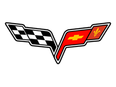
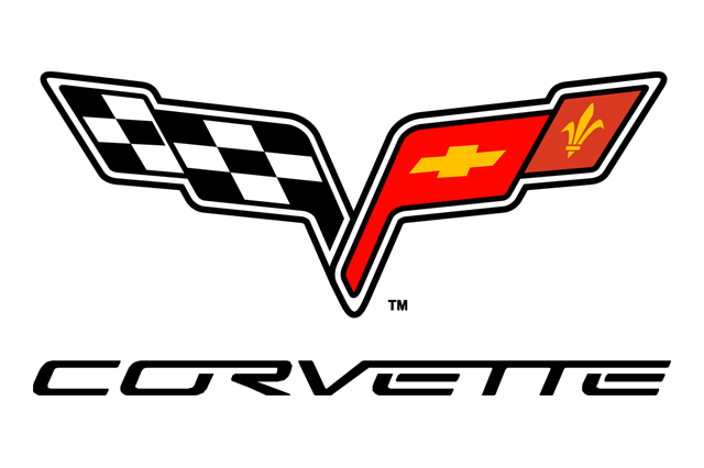
In the 2004 redesign, the Corvette logo underwent a transformation to achieve a neater and more compact design. One noticeable change was the removal of the circle that was present in the previous design, which resulted in a cleaner and more streamlined appearance.
Additionally, the lines of the flags in the logo were shortened, contributing to the overall compactness of the design. This change likely helped create a more cohesive and balanced logo.
8of 102014
PNG
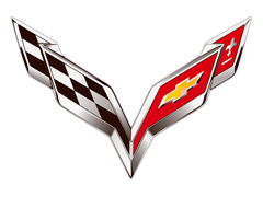
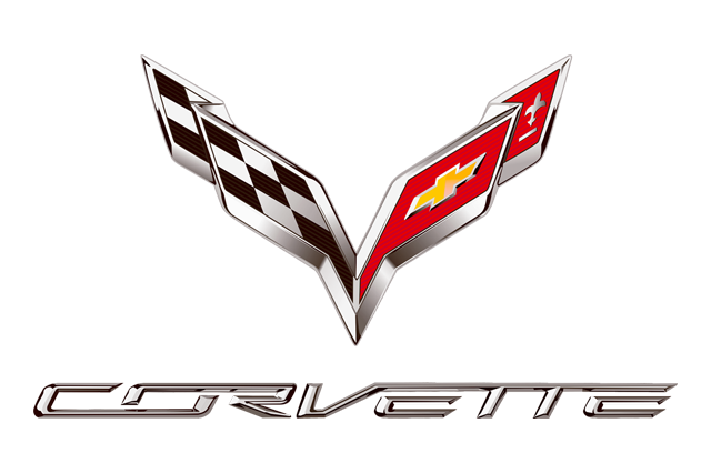
In 2014, with the introduction of the seventh generation of Corvette cars, the logo underwent a redesign to create a new symbol for this iteration.
One significant change was the repositioning of the flags into a distinct V-shape. This new arrangement of the flags added a sense of dynamism and visually represented the V-shaped concept associated with the Corvette.
The typography, or lettering, of the logo remained unchanged. However, the letters were now silver in color, providing a metallic appearance that complemented the overall design.
The graphic part of the logo featured a metalized outline with shading. This gave the logo a more three-dimensional and dynamic appearance, adding depth and enhancing its visual impact.
9of 102019
PNG
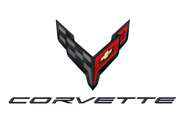
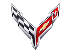
The Chevrolet Corvette C8 logo features a design that emphasizes the "V" shape even more than the previous iteration. The developers removed the V-notch at the bottom of the emblem, bringing the flags closer together and enhancing the V-shaped appearance.
In the lettering of the logo, the developers separated the letters, making the brand name easier to read and more distinct.
The colors used in the logo are lighter, providing a fresh and modern look. The upper corners of the emblem are sharper, adding a sense of sleekness and refinement to the design.
The C8 logo, often referred to as the "butterfly" logo, was leaked in February 2019 and later appeared in official renders.
10of 102020-Present
PNG
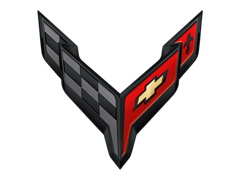
The introduction of the mid-engined C8 Corvette represents a significant milestone in the evolution of this iconic American performance nameplate. Alongside this shift, Chevrolet has unveiled a new logo design that reflects the changes and advancements of the C8 model.
The black version of the updated Corvette logo enhances the overall aesthetics of the car, adding to its aggressive and sleek appearance. The use of black can provide a more assertive and striking look, further emphasizing the performance-oriented nature of the Corvette.
By incorporating this black version, Chevrolet aims to enhance the visual impact and convey a sense of power and sophistication. It's an exciting update that contributes to the overall transformation and modernization of the Corvette brand.
 Volkswagen
 Toyota
 Stellantis
 Mercedes-Benz Group
 Ford Motor
 Michelin
 Bridgestone
 Continental
 Goodyear
 Sumitomo