| Rank | Company | Country |
|---|---|---|
| #1 | Germany | |
| #2 | Japan | |
| #3 | Netherlands | |
| #4 | Germany | |
| #5 | United States |
| Rank | Company | Country |
|---|---|---|
| #1 | France | |
| #2 | Japan | |
| #3 | Germany | |
| #4 | United States | |
| #5 | Japan |
The trident symbolizes strength and power, which aligns with the performance and luxury associated with Maserati cars.
In Italian, the word "maserati" doesn't have a specific meaning. The name "Maserati" is derived from the surname of the Maserati brothers (Alfieri Maserati, Bindo Maserati, Carlo Maserati, and Ettore Maserati), who founded the company. Therefore, "Maserati" doesn't have a direct translation or meaning in Italian beyond being a proper noun associated with the luxury car brand.
The credit for the design of the Maserati logo goes to Mario Maserati, the fifth-born brother of the Maserati family.
He is the fifth of the Maserati brothers, and he was the only one who wasn’t interested in cars or motor racing. Instead, he loved the arts and studied at Brera Academy. As such, he was the one Alfieri Maserati asked to create an image that represented the product that would carry the Maserati family name on the roads of Italy and beyond.
Legend has it that Mario took a walk around Bologna and discovered the statue of Neptune, the god of the sea, at the end of Piazza Maggiore. The statue depicted Neptune holding a trident, a three-pronged spear. Mario found inspiration in the trident and decided to incorporate it into the Maserati logo.
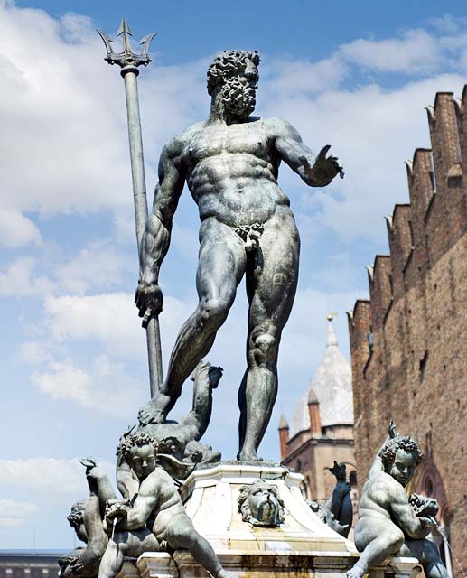 Piazza Maggiore's Neptune and his tridentThe Fountain of Neptune (in Italian: Fontana del Nettuno) is a famous monument located in the city of Bologna, Italy. It is one of the major symbols of the city and an important landmark.
The trident symbolizes strength and power, which aligns with the performance and luxury associated with Maserati cars. The design was well received, and since then, the trident logo has become an iconic emblem associated with the Maserati brand.
The trident logo was first introduced in 1926 by the Maserati brothers, Alfieri, Ettore, and Ernesto, who founded the company. They chose the trident as a symbol of their brand to convey the dynamic performance, luxury and prestige associated with their cars.
Over the years, the trident logo has undergone some refinements, but its basic design has remained consistent. It has become instantly recognizable and is associated with the high-performance, luxury, and craftsmanship that Maserati vehicles are known for.
Today, the Maserati logo still prominently displays the trident, often accompanied by the company name, on the front grille, steering wheel, and other parts of their vehicles. It continues to evoke a sense of power, luxury, and performance, representing the essence of the Maserati brand.
RELATED: The 7 Most Expensive Maseratis Ever Sold At Auction
The trident shape, which is now synonymous with the Maserati brand, first appeared on Maserati's first model, the Tipo 26. This iconic logo witnessed Maserati's dominance on the track during its glorious years, cementing the brand's reputation as a high-performance luxury car manufacturer.
In 1937, Maserati underwent a significant redesign of its logo, which resulted in a new and improved version of the badge. The trident was redrawn and placed within a silver oval, which was positioned atop a red triangle. The wordmark was moved to the bottom of the oval and separated into two segments, adding to the badge's sense of balance and symmetry. This design has since become an iconic symbol of the Maserati brand, representing the brand's commitment to power, luxury, and performance.
The Maserati logo underwent another significant change in 1943, swapping the red and silver for blue, white, and gold. The trident remained a significant feature of the badge, while the overall design was simplified. The badge featured a blue oval and a much larger word mark in white font, giving it a more modern and streamlined look.
In 1951, Maserati returned to a previous version of its logo, featuring the ornate red trident placed inside an oval that was horizontally divided into two parts. The larger white area housed the trident image, while the smaller blue portion at the bottom featured the Maserati wordmark in white. This design was a nod to the brand's heritage and helped to reinforce its commitment to power, luxury, and performance. The logo has since become an iconic symbol of the Maserati brand, recognized worldwide by car enthusiasts and drivers alike.
It's interesting to know that the logo underwent another slight update in 1954, featuring a more pointed oval and a darker shade of blue. The white and blue outlines around the oval were also more evident in this version of the logo, adding to its visual impact and making it more recognizable from a distance.
An unusual change to the Maserati car emblem emerged in 1983, featuring a simplified trident and fewer colors (just black, white, and blue). This version of the logo didn't last long and was quickly replaced by something similar to the old Maserati logo from 1954. The return to the classic design was likely an effort to reinforce the brand's heritage and commitment to power, luxury, and performance.
In 1985, Maserati returned to a logo design from the 1950s but with delicate changes. The white lettering was set in thinner lines, adding sophistication to the badge and making it look more elegant. Additionally, the bottom part of the logo became slightly smaller, while the badge itself was enlarged with its contours refined. These changes helped to modernize the logo while still retaining its classic look and feel.
The Maserati logo underwent another change in 1997, with a longer and more refined oval shape that appeared more delicate than previous iterations. In this version of the logo, the various elements of the badge were refined, enlarged, and narrowed to create a more balanced and elegant design. The lettering on the blue part of the badge became more confident and bold, with the white capitals enlarged and strengthened. Additionally, the dark red trident was redrawn in thinner and more delicate lines, further enhancing the badge's overall look and feel.
The 2006 redesign of the Maserati logo widened the badge and enlarged its blue part, making it almost half of the logo. The white uppercase lettering was rewritten in a classy traditional serif typeface with medium-thick lines and elongated serifs, adding to the logo's overall elegance and sophistication. Additionally, the color of the trident was brightened up and now featured a vivid scarlet-red shade, creating a more eye-catching and memorable logo.
The 2015 redesign of the Maserati logo introduced a monochrome badge with the uppercase logotype in an elegant serif typeface enlarged and accompanied by a small black trident placed above it without any framing or color accents. This was probably the simplest badge Maserati ever used, and it stayed in use for almost five years.
Overall, this simplified version of the logo helped to create a more modern and minimalist look, while still retaining the classic elements of the Maserati brand.
In 2020, the Maserati badge was redrawn again, with the color palette remaining untouched, but the style of the lettering completely changed. The black trident was enlarged and now looks as powerful as a bold futuristic inscription in a custom cursive typeface. The logo now looks very powerful and progressive, yet still elegant and chic. These changes helped to modernize the logo even further while still retaining the classic elements of the Maserati brand. The new custom cursive typeface adds a touch of uniqueness and exclusivity to the logo, making it more memorable and recognizable.
The launch of the MC20, as Maserati's first modern mid-engine super sports car, signifies a new era for the brand. The redesigned logo reflects this evolution and conveys a sense of modernity, sophistication, and performance.
| Rank | Company | Country |
|---|---|---|
| #1 | Germany | |
| #2 | Japan | |
| #3 | Netherlands | |
| #4 | Germany | |
| #5 | United States |
| Rank | Company | Country |
|---|---|---|
| #1 | France | |
| #2 | Japan | |
| #3 | Germany | |
| #4 | United States | |
| #5 | Japan |