
| Rank | Company | Country |
|---|---|---|
| #1 | Germany | |
| #2 | Japan | |
| #3 | Netherlands | |
| #4 | Germany | |
| #5 | United States |
| Rank | Company | Country |
|---|---|---|
| #1 | France | |
| #2 | Japan | |
| #3 | Germany | |
| #4 | United States | |
| #5 | Japan |
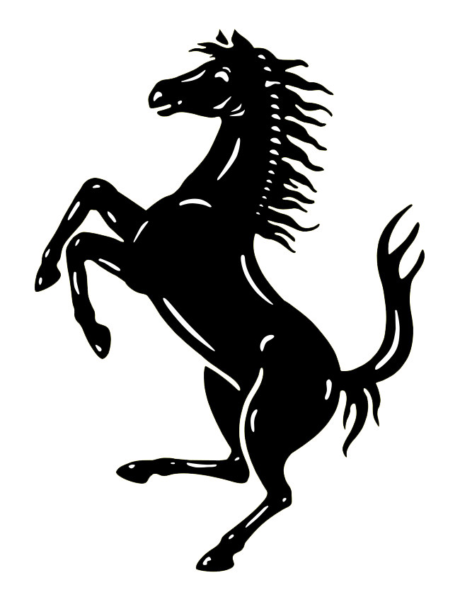
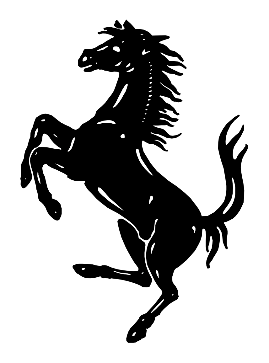
The prancing horse is a symbol of power and speed; the horse was originally the emblem of Count Francesco Baracca.
The Ferrari brand is named for the founder of the company, Enzo Ferrari.
The word "Ferrari" means "blacksmith" in Italian In Italian, the word "ferraro" means blacksmith, and over time, this occupation gradually evolved into a surname, which is how the name Ferrari came to be1. Enzo Ferrari, the founder of Ferrari, came from a family of metalworkers and was himself a skilled mechanic and racecar driver before founding the company in 1947.
Today, Ferrari is synonymous with luxury, speed, and exclusivity.
The history of the Prancing Horse emblem is both interesting and unusual, as founder Enzo Ferrari offered an account of the horse's origins.
The origin of Ferrari's prancing horse logo, or "Italian: Cavallino Rampante," dates back to World War I. The logo was first used by Italian flying ace Francesco Baracca, who painted it on the side of his fighter plane.
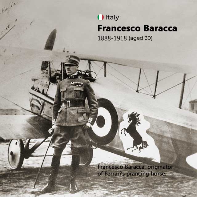 Francesco Baracca, originator of Ferrari's prancing horse.
Enzo Ferrari recalled his first Savio Circuit victory, at Ravenna on 17 June 1923. He had met Count Enrico Baracca and Countess Paolina, parents of the flying hero. One day the Countess said to him: "Ferrari, why don't you put my son's prancing horse on your cars? It'll bring you good luck." The horse was and will always be black, and Ferrari accepted the suggestion.
It's worth noting that Ferrari made several adjustments to the horse's design, including adding the Italian tricolour, changing the position of the horse's legs and tail, and placing it inside a canary yellow shield — the "colour of Modena," Enzo's hometown.
The Prancing Horse emblem was first used on Scuderia Ferrari cars at the 9 July 1932 Spa 24 Hours race. The emblem was added to the Alfa Romeo cars used by Scuderia Ferrari at the time, and the race was a significant event for the team, as they dominated the race with their 8C 2300 MM cars.
So, when Enzo Ferrari founded his own car company (Ferrari S.p.A.) in 1947, he naturally chose to use the emblem as the logo for his company as well. Since then, the Prancing Horse emblem has become one of the most recognizable and iconic logos in the world, representing not only Ferrari's racing success but also its reputation for luxury, performance, and style.
If you are a curious person who wants to know more about Prancing Horse, read on...
There is still some debate about the origin of the Prancing Horse emblem on Francesco Baracca's plane.
It is commonly believed that the Prancing Horse emblem on Francesco Baracca's airplane was created by Baracca himself as a tribute to his cavalry regiment, which had used a similar symbol since 1692.
Another version of the story claims that the emblem originated as a kill mark, applied after Baracca shot down a German pilot from Stuttgart, a city whose coat of arms depicts a similar horse. (if true, this would make the Prancing Horse distantly related to the horse found on Porsche's logo, itself derived from the arms of Stuttgart).
Another theory surrounding the origin of the Prancing Horse emblem on Francesco Baracca's airplane is that it was inspired by his family's coat of arms, which featured a rampant black horse on a grey background. It is possible that Baracca modified his family's coat of arms slightly to create the emblem on his airplane, symbolizing the speed and agility of his aircraft.
Despite the uncertainty surrounding its origin, the Prancing Horse emblem on Baracca's plane undoubtedly had a profound impact on Enzo Ferrari and his automotive company. Ferrari was deeply inspired by Baracca's bravery and success as a fighter pilot, and he adopted the emblem as a symbol of his own racing team and later his automotive company. Today, the Prancing Horse emblem is one of the most recognizable logos in the world and is a powerful symbol of Ferrari's legacy in the automotive industry.
RELATED: 10 Car Logos with Horse, Did You Know?
The Ferrari logo has a rich history that dates back to the founding of the Scuderia Ferrari racing team in 1929. The first Ferrari badge, which appeared on the bodies of two Alfa Romeo racing cars in 1932, featured a prancing horse on a yellow background, with the letters "S" and "F" at the bottom to represent Scuderia Ferrari. The prancing horse was inspired by the emblem of Italian World War I flying ace Francesco Baracca, whose family had given Enzo Ferrari permission to use the horse on his racing cars.
The debut Ferrari logo was introduced in 1932 and featured a solar shield with a black horse, flanked by the letters "S" and "F" in thin italic uppercase font. The letters stood for "Scuderia Ferrari," which translates to "Ferrari Stable" or "Ferrari Team" in Italian. At the top of the shield were three stripes in the colors of the Italian flag - green, white, and red, which symbolized Ferrari's Italian heritage.
This logo was first used on the cars participating in the Spa Grand Prix race in 1932 and has since become the main symbol of Ferrari, appearing on all branded products. Over the years, the logo has undergone several modifications, but the prancing horse and the Italian flag colors have remained constant symbols of Ferrari's racing heritage and performance.
The Ferrari logo introduced in 1939 was different from the previous badges of the brand. The badge from the thirties was composed of a gradient orange medallion in a thick yellow frame with a thin black outline and an elegant black "Auto-Avio Construzioni" inscription.
The iconic black horse on this logo was also modified - the graceful animal was turned to the right and had two elegant widespread wings behind its back. The upper curved part of the shield was straightened and painted with the colors of the Italian flag - green, white and red, which symbolized Ferrari's Italian heritage.
Enzo Ferrari founded Ferrari S.p.A. in 1947 and chose to use the prancing horse emblem as the logo for his company as well. In the same year, Ferrari introduced a new logo design that replaced the traditional triangular shields with a rectangular one with rounded corners.
The base of the logo is still yellow but has a pale tint. The black horse is turned to the left and enlarged to take up more space, and with one foot, he stands on a long strip, which is a continuation of the upper horizontal stroke of the letter "F." The rest of the glyphs are below this line and are written in bold serif type. Above the head of the prancing horse flaunts the Italian tricolor, and all elements are outlined in gold.
This new logo design has become an iconic symbol of the Ferrari brand and its racing heritage and performance.
In 1951, Ferrari made some changes to the logo design.
The silhouette of the prancing horse was reduced in size so that it no longer touches the lower inscription. The base of the logo was changed to a classic vertical rectangle, which was colored in a rich shade of yellow. The colored stripes at the top of the logo were also changed to rectangles, but they were now horizontally oriented. These changes made the logo more streamlined and modern, while still retaining its iconic elements.
The new design has remained largely unchanged since then, with only minor tweaks and adjustments made over the years to keep it up to date and fresh.
The 1981 redesign of the Ferrari logo saw the colors of the logo intensified, and all contours were cleaned up and emboldened. The vertically-oriented rectangle was enclosed in a thick silver frame, which supported the outlines of all the decorative elements on the banner. These changes made the logo more modern and stylish, while still retaining its iconic elements.
The 1994 Ferrari logo redesign was a significant moment in the brand's history, as it marked a shift towards a more modern and sophisticated visual identity.
The new logo featured a more streamlined design, with the horse's head and neck positioned at a sharper angle and the letters of the wordmark spaced further apart. The redesign helped to update the brand's image and appeal to a wider audience, while still maintaining its racing heritage and prestige.
The 2002 redesign of the Ferrari logo did not change the overall design of the logo, but rather made some subtle updates to the flag. The black lines between the green, white, and red stripes were removed, giving the logo a smoother and more modern look.
The horse was redrawn to look more powerful, with a more muscular appearance and a more dynamic pose. The position of the right front foot was also adjusted to be higher than in the original logo, giving the horse a more dynamic and forward-leaning stance.
Overall, the update makes the logo's lines smoother and more consistent, but the overall design remains largely unchanged.
RELATED: Top 10 Fastest Ferrari of all Time
The Scuderia Ferrari logo features a shield-shaped design with a black prancing horse on a yellow background, with the letters "S" and "F" on either side of the horse. The letters "S" and "F" stand for "Scuderia Ferrari," which is Italian for "Ferrari Stable" or "Ferrari Racing Team." The logo is also crowned with green, white, and red stripes, which are the colors of the Italian national flag and serve to emphasize Ferrari's Italian heritage and identity.
The Scuderia Ferrari logo is often applied to the side of Ferrari sports cars as a way to represent the racing division of the Ferrari company. The logo is a prominent visual element that helps to identify the car as a Ferrari and reinforces the brand's strong connection to racing and high-performance sports cars.
In 2002, Ferrari updated the Prancing Horse logo to give it a more modern and dynamic look. The new version of the logo featured a more muscular and powerful horse, with a more dynamic pose and a higher right front foot. The changes were designed to reflect the company's commitment to innovation and progress, and to convey a sense of speed, power, and forward motion.
The stylized "Ferrari" text that appears underneath the Prancing Horse logo is a custom-designed font that is unique to the Ferrari brand. The font is a slab serif typeface that is bold and powerful, with a distinctive look that reflects the brand's commitment to speed, power, and racing excellence.
The font used for the "Ferrari" text has inspired many imitations and similar fonts over the years, including the Ferro Rosso font designed by Michael Hagemann.
RELATED: Top 10 Most Expensive Ferrari in the World
| Rank | Company | Country |
|---|---|---|
| #1 | Germany | |
| #2 | Japan | |
| #3 | Netherlands | |
| #4 | Germany | |
| #5 | United States |
| Rank | Company | Country |
|---|---|---|
| #1 | France | |
| #2 | Japan | |
| #3 | Germany | |
| #4 | United States | |
| #5 | Japan |