| Rank | Company | Country |
|---|---|---|
| #1 | Germany | |
| #2 | Japan | |
| #3 | Netherlands | |
| #4 | Germany | |
| #5 | United States |
| Rank | Company | Country |
|---|---|---|
| #1 | France | |
| #2 | Japan | |
| #3 | Germany | |
| #4 | United States | |
| #5 | Japan |
The Porsche logo is a combination of different elements that represent the origin of the company (Stuttgart) and the culture of the region in which it is located.
The Porsche brand is named after its founder, Ferdinand Porsche.
The Porsche brand was founded in 1931 in Stuttgart, Germany, by Ferdinand Porsche and has since become one of the most iconic and recognizable luxury car brands in the world.
The word "Porsche" is a surname of Austrian-German origin, and it does not have a specific meaning in German or any other language. The founder of the Porsche car company, Ferdinand Porsche, had the surname "Porsche." The name "Porsche" is simply a family name that has become associated with the iconic luxury car brand that Ferdinand Porsche founded in 1931 in Stuttgart, Germany.
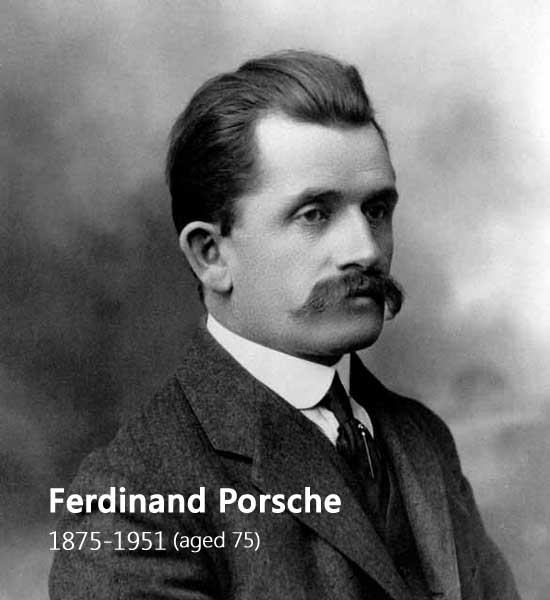 The founder of the Porsche car company — Ferdinand Porsche (1875-1951, aged 75)
Ferdinand Porsche was an Austrian-German automotive engineer who is best known for creating the first gasoline-electric hybrid vehicle, the Volkswagen Beetle, and the Porsche 911. He was a prolific designer and engineer who had a significant impact on the automotive industry.
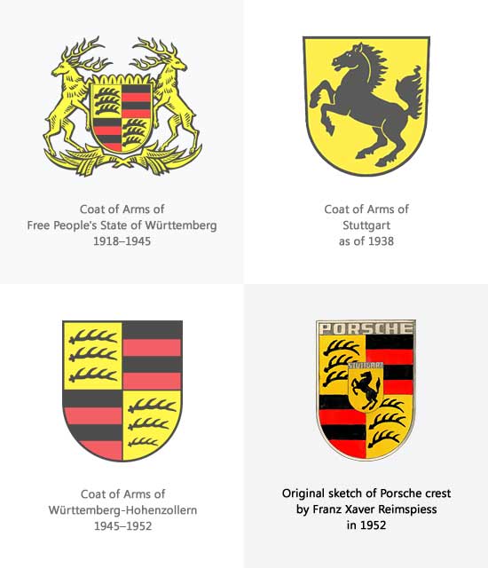
According to official Porsche sources, the Porsche logo was designed by Franz Xaver Reimspiess, a senior designer at Porsche, who drew inspiration from the Coat of Arms of Stuttgart and the Coat of arms of Baden-Württemberg (Württemberg-Hohenzollern 1945–1952) to create a symbol that represented the company's roots and its commitment to quality and dynamism.
 The Origin of the Porsche Crest
The Porsche logo was first registered with the German Patent Office in 1952. In the same year, the shield-shaped logo appeared for the first time on the position of the steering wheel horn of the Porsche 356. Unfortunately, Porsche's founder Ferdinand Porsche did not live to see this emblem used widely on Porsche cars.
The city of Stuttgart has a long history of horse breeding and stud farms, dating back to its founding in the 10th century. The Stuttgart city seal, which features a rearing horse, has been in use since the 13th century and is a symbol of the city's proud equestrian heritage.
The Porsche logo, designed by Franz Xaver Reimspiess, draws inspiration from Stuttgart's city seal and incorporates a rearing horse into the center of the shield shape (evolved from the coat of arms of Württemberg). The horse in the logo symbolizes the power, agility, and elegance of Porsche cars, and it was a fitting addition to the emblem, given Stuttgart's history as a center of horse breeding and stud farms.
In addition, Horses have been historically associated with speed, strength, and power, and this symbolism is also can reflected in the Porsche sports cars. The horse in the logo is shown rearing up, which conveys a sense of energy and motion. This also symbolizes the company's commitment to producing high-performance sports cars that are known for their speed and power.
The Porsche logo's antlers and black and red stripes were influenced by the coat of arms of Baden-Württemberg, which has red and black as its state colors. This design honors Baden-Württemberg, the region where the company's headquarters are located, and its rich cultural heritage.
The Baden-Württemberg is a state in southwestern Germany, known for its automotive industry, including Porsche. The region is home to several other major car manufacturers, including Mercedes-Benz and Audi, and is commonly referred to as the "cradle of the automobile."
Overall, the Porsche logo is a combination of different elements that represent the history and heritage of the region where the company was founded and is based.
RELATED: Ferrari Logo vs. Porsche Logo, Why are they Similar?
Coat of arms of Free People's State of Württemberg 1918–1945
Ferdinand Porsche established his design company (Dr. Ing. h. c. F. Porsche GmbH) in Stuttgart during a tumultuous period in German history, with the Nazi Party gaining power. Given the circumstances, Porsche did not have much time to devote to designing a new graphic image for his company, so he decided to use the coat of arms of Württemberg as the corporate logo for the company. This logo is widely regarded as the first corporate logo in the history of the Porsche company.
It's interesting to know that the state of Württemberg made significant changes to the coat of arms during that period, even though there was no change in the geographical division. The four areas in the center of the coat of arms being diagonally symmetrical, the classic antler elements, and the coat of arms are all important components of the design. Additionally, the black and red flag of Württemberg, as well as the stags on the left and right sides, were animal totems that Württemberg took pride in.
RELATED: 56 Car Logos with Animals: The Complete List
Coat of arms of Stuttgart as of 1938
The history and culture of a region can play a significant role in shaping the identity and design of a brand.
The coat of arms of Stuttgart was first introduced in 1938 and was used as the official logo of Stuttgart, the capital of Württemberg. Due to its historical significance and cultural importance, Porsche, being based in Stuttgart, chose to incorporate the small shield mark into its brand identity.
The small shield mark has since become an iconic symbol for Porsche and is recognized worldwide. Its incorporation into the Porsche logo is a testament to the importance of history and heritage in building a brand identity that resonates with people and creates a sense of connection with the community in which it was founded.
Württemberg-Hohenzollern 1945–1952
After World War II, Württemberg was split into three parts. Württemberg-Hohenzollern, which was forced to separate, has since then had its own state constitution, flag and logo.
Württemberg-Hohenzollern adopts a black and red two-color flag, which is also divided into four areas. These areas are diagonally symmetrical, and each has a figurative antler element in the upper left and lower right corners, as well as state flags in the upper right and lower left corners. The overall shape is simple and elegant; it was simplified from the previous Württemberg logo, which at this time resembles Porsche's later brand logo.
Also during this period, Porsche and his sons, as well as some leaders of the Porsche company, began designing a logo for the brand. After some discussion, their ideas quickly reached a consensus: The logo should first reflect the characteristics of Porsche's "hometown" of Stuttgart, Germany; second, it should be very sporty in design and powerful in functionality; and third, it should make people remember it forever.
The 1952 Porsche crest was a significant milestone in the evolution of the Porsche brand identity, reflecting the company's deep roots in the cultural and historical context of Stuttgart and Wurttemberg.
The Wurttemberg coat of arms was chosen because it represented the birthplace of the Porsche brand, which was located in Stuttgart, the capital of Wurttemberg. The design of the logo has undergone several revisions over the years, but the fundamental elements have remained the same.
While the creation of the Porsche logo isn’t completely agreed on, Germans contend that the Porsche crest was designed by engineer Franz Xaver Reimspiess.
However, North Americans believe that Ferdinand Porsche’s son, Ferry Porsche, drew the Porsche logo on a napkin during a meal with Max Hoffman, the American Porsche distributor. After bringing the logo design back to Germany, Ferry Porsche had it polished up and put on the company’s cars.
No matter the origins, the iconic Porsche crest was introduced to the American market in 1952 and has become an easily recognized symbol for luxury and power in the automotive industry.
The Porsche logo in 1963 featured a refined design that was all metallic, with the shield and the wordmark at the top of the design done in a matt golden color. Additionally, gold lines were added between the black and red stripes, making the emblem well-defined and sharp-cut.This design was created in anticipation of the launch of the iconic Porsche 911 sports car.
Also, in 1963 an additional text-based logo was created for the brand. This wordmark can be used on its own or placed under the ornate gold emblem. The custom sans-serif typeface of all-caps wordmark looks powerful and confident with clean smooth lines, which are slightly extended and flattened.
The arrival of the Porsche 911 sports car in 1963 marked a significant moment in the history of the Porsche logo. Prior to the launch of the 911, the Porsche crest was not commonly used on the bonnet of Porsche cars. However, with the launch of the 911, the Porsche crest was proudly placed on the bonnet, where it has remained ever since. This placement of the crest on the bonnet of Porsche cars has become an iconic feature of the brand.
In 1994, Porsche made some changes to their logo design. They changed the lettering, which was previously gold, to black in internal, making it more visible and creating a better balance with the rest of the logo. The stallion in the center of the logo was also redrawn with thinner and more elegant lines, giving it a more refined and sophisticated appearance.
These changes were subtle but had a significant impact on the overall look and feel of the Porsche logo. The black lettering made the logo more legible and easier to read, while the refined stallion added a touch of elegance and sophistication to the design.
The emblem of Porsche has gone through several updates during the long history of the brand’s existence. However, those changes in recent years were not very significant, they were mainly decorative.
The Porsche logo was refined again in 2014. The golden shade in the logo was made slightly brighter on the main crest and lighter in the central one with the stallion. The lettering on the upper banner was also refined, with the extended letters set in medium-weight lines, giving the logo a more modern and sleek appearance.
Overall, the Porsche logo is a powerful and enduring symbol of the brand's heritage and legacy, reflecting the company's deep roots in the cultural and historical context of Stuttgart and Wurttemberg.
RELATED: 10 Porsche Models Worth Collecting and Buying
| Rank | Company | Country |
|---|---|---|
| #1 | Germany | |
| #2 | Japan | |
| #3 | Netherlands | |
| #4 | Germany | |
| #5 | United States |
| Rank | Company | Country |
|---|---|---|
| #1 | France | |
| #2 | Japan | |
| #3 | Germany | |
| #4 | United States | |
| #5 | Japan |